IN THE WORKS 06/25
A monthly update from inside PREST WORKS.
Hello,
This month’s been an extremely busy one. My full-time job has been taking up a lot of time, with evenings spent doing overtime, and work on PREST has ramped up too since I decided on a launch date. And now I’m at Glastonbury. It’s felt like a bit of a whirlwind.
So, here’s what’s been happening at PREST in June.
TLDR: Launch date. A limited edition. Logo, colour & typography. Physical turned digital.🚀 Launch date
I’ve finally decided. I’ll be launching PREST in September. Back-to-school season seemed fitting. Obviously that’s only 2 months away now, and I’m on holiday for 3 of those weeks. It’s ambitious. Maybe too ambitious. Between now and then, I’ve got to finalise and make the product, design the packaging, test the shipping, shoot the product, build the website, and somehow squeeze it all in around my day job, all whilst posting on social media too. But I’ve set the deadline, and I’m sticking to it. I’ve got it all mapped out (I think).
📘 Limited edition blue
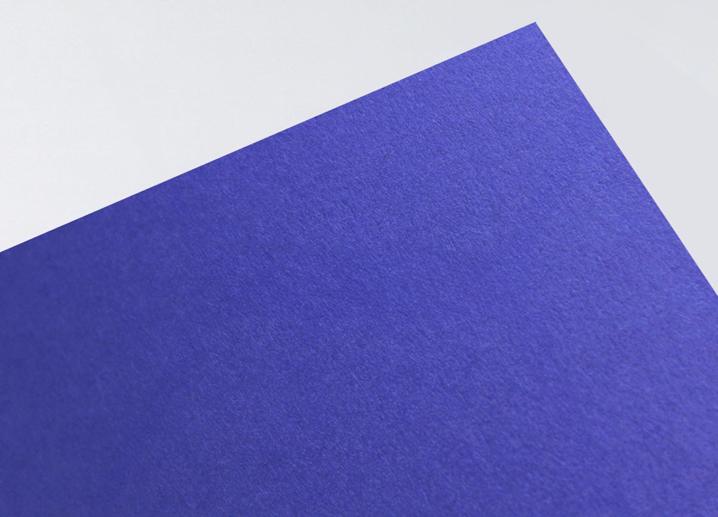
My original plan was to launch PREST with 5–7 different exercise book colours. Turns out producing that many colours in such a small batch just isn’t very feasible. Plans had to change. I’ve managed to secure the last of some discontinued paper that happens to match PREST’s branding perfectly. Made in England, it’s thick, durable and slightly textured. And it’s now officially out of production. That means once it’s gone, it’s gone. A true limited edition. Fewer decisions, more focus, and a much stronger tie-in with the brand. I’ll release more colours as the brand grows and production increases. I hope you like blue for now.
A branding deep dive (part 2)
🌀 Logo
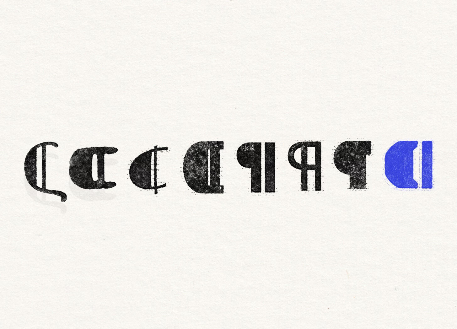
This is a pilcrow ¶. Often mistaken for a backwards “P” for paragraph, it actually began as a “C” for capitulum (Latin for “chapter”). It used to be hand-drawn in manuscripts to mark a new thought. It’s mostly vanished from use now, replaced by paragraph indentations. But it lives on as a hidden character known mostly to editors, proofreaders and type nerds like me.
I designed a modern pilcrow as our logo and maker’s mark. It symbolises the start of something new. A new idea, a new project, a new chapter. That’s exactly what I want PREST to be: the place where your next idea starts. And it subtly represents the P in PREST and the C in Callum (my name). Nice.
🎨 Colour
If you’re building a brand, don’t just choose your favourite colour. Choose colours for a reason. They should ladder up to your overall strategy. Blue was a no-brainer for PREST. It’s been a significant colour in the history of creativity and making, from Frida Kahlo’s house to the creation of Klein Blue. From the first internet links to the fabrics of the durable jeans and overalls worn by creatives and craftspeople around the world. It’s timeless but forward-looking. Traditional but modern. It truly represents the makers and doers of the world.


Even though blue was a no-brainer, it’s taken a long time and lots of trial and error to get the right blue. Call me obsessive but I think I tested over 40 different shades to get the right one. It’s bright, with a slight hint of purple in there. Maybe it’s verging on indigo? To support the blue, I’ve gone for a couple of neutrals. Off-white to represent paper or a blank canvas, and off-black to represent ink. I’m sure I’ll add and expand on this as time goes by but for now, it works.
🔤 Typography
PREST is for modern makers. For the people who create instead of consume. I knew I wanted something a bit industrial to reflect this feeling, drawing inspiration from Manchester’s factories where PREST is based. I knew I wanted a nice serif typeface as well, similar to what’s used on vintage school exercise books. I experimented with a lot of typefaces (too many) before finding the right ones. I finally settled on Blender and Etna for the logotype and display serif.
As well as the logotype and serif, the brand needed a workhorse typeface. Something more practical to be used for longer pieces of text. I chose Geist, an open source typeface that comes in Sans and Mono formats. But I didn't just want to use the standard version, so I’ve customised it to fit the PREST brand. Instead of being sharp and crisp, I’ve added subtle curves to the corners, imitating the effect of printing physical letters into paper.
📝 Physical turned digital
In the last email, we defined PREST’s enemy: the mobile phone. The digital world is great, and it’s how I’ve been able to find and grow this community, but I think we’re all ready for a bit of a break from it to be honest. To bring the physical world to our digital identity, I’ve been leaning heavily on the amazing work of Tim Saunders over at Bracken. His Photoshop filters help to bring those lovely printed textures into digital formats. I want to expand on this a little further and explore how this plays out across different brand touch-points. I’ll get round to that eventually.


